
Neural activity animated visualization
This project presents a piece of software that I wrote for my student employee
job at the Knowledge Technology Research group.
The problem of plotting data in many dimensions
Every data-scientist knows the struggle of visualizing high dimensional data. Most 2-dimensional plots are fairly easy to read and can be grasped within one quick glimpse over the plot, at least when the plot is well done. What is also relatively trivial and vastly popular is the practice of plotting different items in different colors, where color acts as an additional dimension in a 2-dimensional plot. However, plots often get much messier and inherently harder to read when we shift them into three spatial dimensions. Not only do 3-dimensional introduce significant perceptual overload, but there is also the fundamental problem that very, very clear trends can be completely shadowed, depending on the virtual camera angle, through which the plot is represented. The data that I was given for this task consisted of two factors and their development over time as a third factor, which has exactly the problem of producing a three-dimensional plot. Thus, the problem at hand is to find a visualization that allows expressing the interplay of these three factors, all in one plot, while maintaining the high amount of readability, typically associated with 2-dimensional plots.
3D Time series plots
Without wanting to depict my teachers and colleagues badly (for whom I have nothing but respect), one example for a plot that is relatively cumbersome to read is given here:
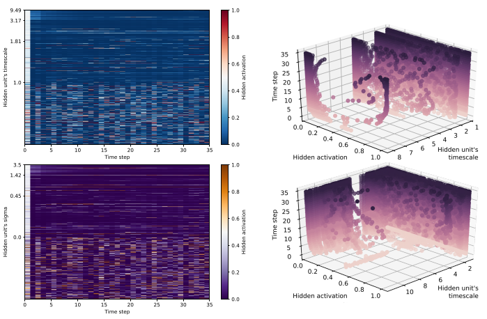
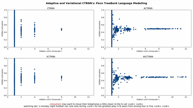
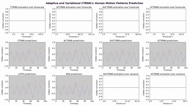
These plots have not been done by me, but contain some of the data that I was tasked with to find a new, better visualization. All the data-vectors for the for the below animations originate from the same paper, so I encourage the interested reader to check it out here.
Given that the visualization was for a conference, not a follow-up version of the paper, we had the opportunity to experiment with animating the results, which brings the plot back into two dimensions, with time being displayed as actual time frames in the animation. The fact that all plots had a time-component fully enabled this, as animations really only make sense when the data has an underlying temporal component.
Matplotlib.animation to the rescue
A quick google search revealed that Python can be used as an animation engine, specifically, with the Matplotlib.animation API (at this point I can’t bunt wonder whether there is something that Python can’t do). There are multiple approaches that can be taken to animate a plot with Matplotlib, the one I personally find most intuitive boils down to creating a callback function that is called for each time step in the animation and sets the data for each MPL artist for the current time step.
Using the Matplotlib.animation API, we can visualize the ealier plot as follows:
We could have opted for a smoother animation, but we wanted to maintain the discrete time-steps for this specific graph, hence the artificial, non-smooth appearance of the animation. This animation already teasers what we can with Matplotlib’s animation framework, but check out the next example:
This illustrates that more complex, but nevertheless concise and seamless animations are also possible in Matplotlib. Here, we combined multiple of the original plots from the original paper into one animation.
Dealing with sparse data
The major stepping stone I encountered when writing the code for the above animations was that of finding means to generate smooth, continuous animations from discrete, sparse data. In the the first example, we kind of embrace the fact that we are dealing with discrete time steps, hence the sharp jumps from frame to frame. However, we likely want our animations to play out smoothly. To achieve this, we have to augment our data with artificial data-points, so that we can achieve the desired framerate. For example, we might want to render at 60 FPS, but when we only have 35 data-points, our animation would be over in roughly half a second… Even though in the final version of the second example, this kind of data interpolation is not used (because we implemented this decaying trace) at one point during development I implemented just that. Thus, I want to share the blog-post that helped me a bunch: Easing Animations with Python by Nicholas Rossi. Even though I did not use his package, Nicholas does a great job at illustrating the problem, hence I wanted to drop the reference here.
Situational animations
While creating animations in Python is incredibly fun, there is one (maybe obvious) drawback to tacking the time component from the third dimension and animating it: It is no longer possible to consider the development or history of the data at one single glance. When the time component is animated, the focus lies heavily on the current frame, and past frames are probably quick to be forgotten. The following image is a good example of where the 3D-visualization (the third dimension is color) nicely reveals a pattern in the underlying data:
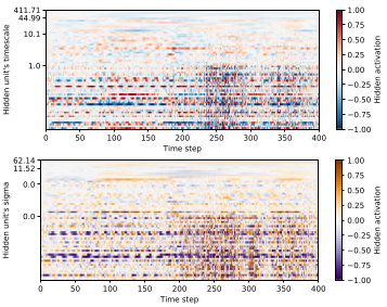
Here, we can clearly see an increase in activity around the 230th time step. If you consider the animation for these two plots (top row, second and third subplot), you might agree that it is harder to keep the entire history of the activation patterns in mind, specifically how the first half compares to the second half.
Final verdict
Animating temporal data can reduce the complexity of plots and make them easier to understand, at the cost of losing some of the compactness of having the entire time series displayed in one frame. Matplotlib’s animation class provides a convenient way for anyone with basic Python understanding to create scientific animations, similar to those presented here. However, larger and more complex animations do take quite a while to render…
As always, find the code associated with this project on my Github
References:
[1] Knowledge Technology Research Group
[2] Adaptive and Variational Continuous Time Recurrent Neural Networks
[3] Matplotlib Animation API
[4] Easing Animations with Python
[5] Code for this project